
A quick look at text - reMarkable
I'd love to share my experience with coding and working on implementing text in librm_lines, and trying to respect every little attention to detail. Check out the project on my GitHub! The research that was done for all mentioned here was funded and partially paid by Scribble thanks to them, I can share my work here with you now.
I have been working on implementing text for quite a while now as some people in the community may also know! But how is text handled inside the .rm format?
The rootText.
Surprisingly unlike other scene object in the file format, that are considered scene items, the text is considered its own can of worms. I do believe that if remarkable wanted to, they could make text boxes (a highly requested feature), you could just have little textbox scene items with a bit of text inside, it shouldn't be too hard to make.
Yet the format only support one giant text area. There are a few things that the tablet makes sure to make when you start typing, first is a style for the Title text that just states it starts at the beginning of the text aka 0:0 (what's that?) yup, the text system uses CRDT Ids, where 0:0 defines either the START or the END, we call this the MARKER_END. So the first thing the tablet has done so far is make the first style, and stored it in a list of styles, it has its own CRDT Id and the NodeId which refers to where this style becomes active in the text.
So let's write some text! You write Test and close the file, the tablet now creates internally counts from the last id, it creates a TextItem with the string Test and the id 1:16 which is the smallest Id if you didn't touch anything and you're on an older device, and I'll use it as an example as it's also the Id that librm_lines lands for the first text. Anyway, this is just one Id, but internally that Id is really only for the first letter T so the rest of the Ids aren't stored anywhere, the tablet just derives that if the text is 4 letters long, and the first letter is 1:16 therefore the all Ids up to 1:19 are present in this document. Here's a visual representation if we unpack the text, expanding these Ids into something comprehensible
{"rootText": {
        "items": {
            "1:16": {
                "deletedLength": 0,
                "leftId": "0:0",
                "rightId": "1:17",
                "value": "T"
            },
            "1:17": {
                "deletedLength": 0,
                "leftId": "1:16",
                "rightId": "1:18",
                "value": "e"
            },
            "1:18": {
                "deletedLength": 0,
                "leftId": "1:17",
                "rightId": "1:19",
                "value": "s"
            },
            "1:19": {
                "deletedLength": 0,
                "leftId": "1:18",
                "rightId": "1:20",
                "value": "t"
            },
            "1:20": {
                "deletedLength": 0,
                "leftId": "1:19",
                "rightId": "0:0",
                "value": "\n"
            }
      }
}}
You can see the text pieces separated including the \n and the END_MARKERS at each end
Oh yeah, also the \n which counts as one more Id, finally we land at 1:20 which then points to 0:0, on the tablet this would look more like this:
{"rootText": {
        "items": {
            "1:16": {
                "deletedLength": 0,
                "leftId": "0:0",
                "rightId": "0:0",
                "value": "Test\n"
            }
      }
}}
The text as it would be (compressed) and stored in this fashion, by the tablet
Here we don't see the Ids, but they are still there. So this is one paragraph! The format does not store any more information, the style says that all text after 0:0 up to the last \n is a Title and it therefore represents it automatically, the format doesn't store any information about the text position or font size.
Text positions, and size...
So this is where it gets a little difficult, okay well I lied... The format does store one important value that might come in handy. The Column Width as a raw value!
The medium is 936 which is exactly 2/3 of the reMarkable2's screen width.
Except this gets weird very quickly...
If a file is made on the Move then it is still 936 so what gives? Despite the tablets storing the raw value, these values are fixed and based on the reMarkable2 which is a little stupid in my opinion, a text made on the Move should have the scales for the Move but I guess they didn't like that approach. So the tablet just tries its best to fit the text, even though 936 is a little big for the Move and the tablet zooms to around 0.8x just to make the text visible. So that's great.. we at least know the value, we can estimate how it fits on different page sizes (the saved device size inside the file).
Okay if the total column width (for medium) is 936 then we can use the following formula to get the text start pageWidth/2-textWidth/2 (234) and.. because the tablet coordinate system is from -halfPageWidth - +halfPageWidth (-702 - +702) and librm_lines uses the tablet coordinate system we can take that text start value and finally subtract half a page width, for medium column width on a rM2 this would be -468 great!
So we now know roughly where the text begins, but if we try and put text there, we quickly realize that that's not the whole story, the text has some margin, well... how do we figure that out... PDFs! Surprisingly PDFs are the most reliable source of metrics that we can use!
We can extract the baseline of text (which we will get to in a bit) and the start of the text!
But more importantly, we can get the font size and weight (which we will also get to in a bit) but first we need to convert the font metrics from pt to well... pixels so how do we do that? PDFs usually render at a DPI and use that to calculate the final pixel sizes for any given pt, so what's the DPI that reMarkable uses? Well we can take a guess. and it looks something like this 1404 / 445 × 72 which gives us roughly 227.164 DPI. Okay we can now convert some of the pt metrics from the PDF, to more useful pixel data, let's look at what that gives.
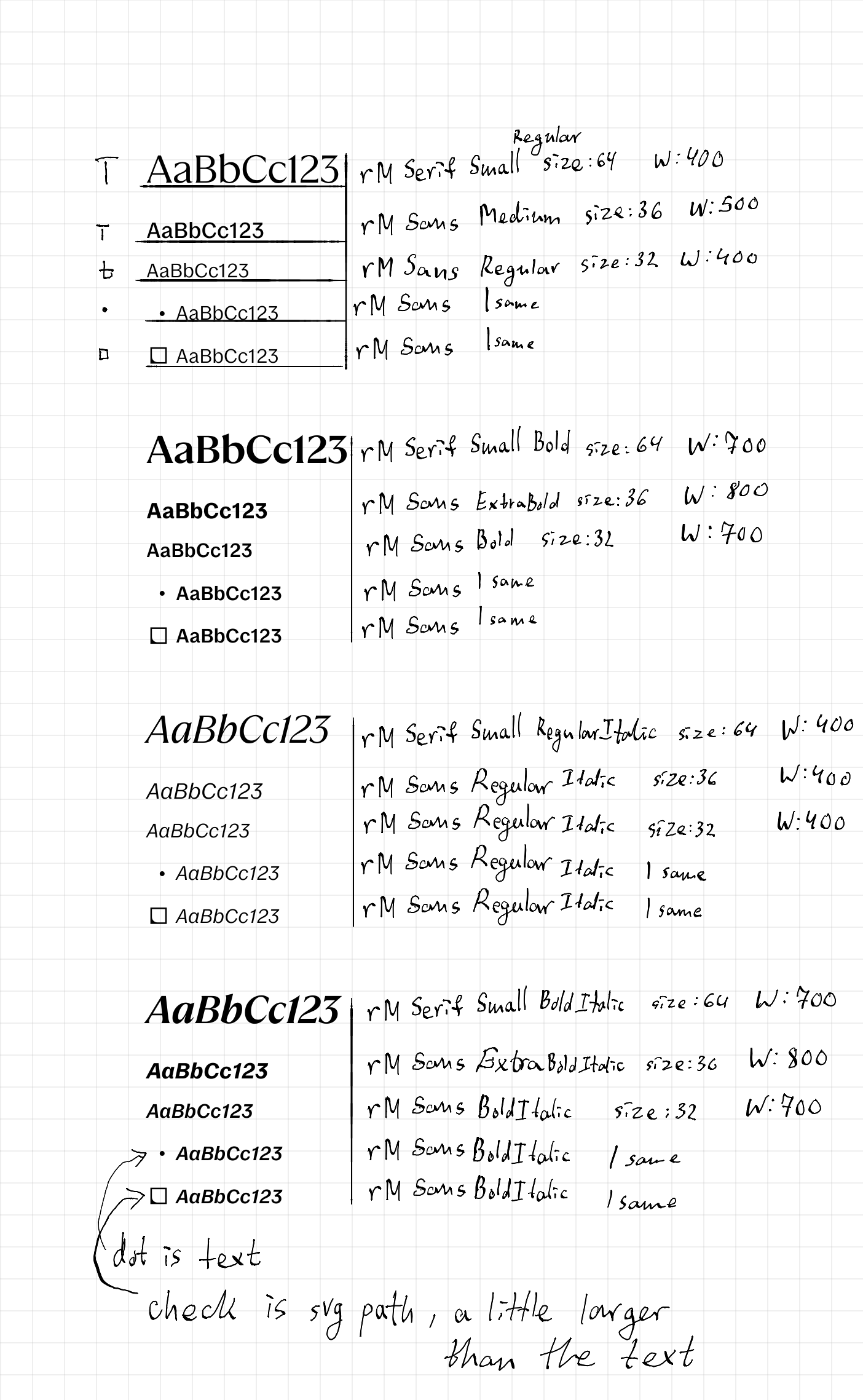
Here we can finally get a sense for the fonts and their sizes, this data might be slightly inaccurate though, the font size for Title is more like 64.05 but I digress, point precision might not be necessary, we already have a good estimate.
Now comes an interesting fact on how the remarkable handles fonts, because surprise, it's not one or two variable fonts, no, instead remarkable has each font separated! If you take a look at the image above again you'll notice I do mention W aka the Weight but those values are in reality not used by remarkable at all, instead all the weights are really just defined by the font itself. So if we wanted to be truthful to this system we need to load all those fonts, and selectively pick the right one, in librm_lines I use the weights as a sort of guideline to help make this a little bit less of a headache.
WAIT, we're missing the Y position? Is that what it's called?
Text anchors, and how they effect lines
Idk who came up with the term anchor, for the text height levels, but anchor might actually be a very accurate representation. Things like group nodes and stuff like that already use anchors to represent a shared positioning guideline, basically if a line is bound to an anchor, its position has to be updated by the anchor's position.
You might see where this is going, each CHARACTER makes an anchor, yup each character, and this is why changing text on your tablet will start messing with and moving your lines around, because the tablet will try to bind those lines to the nearest anchor from text, which I guess makes sense, If I draw a cute cat under my text, but then add some more text, that cute little kitty will get overlapped by text, so instead the new text naturally causes the anchor to move and the kitty moves too!
How exactly the tablet determines which lines go to which anchors is a little bit of a mystery, but it's something like this. There are three main anchors:
- The top anchor, which sits approximately
140 pixelsfrom the top of anrm2page and is the starting anchor that is included even when text isn't present. - The bottom anchor, which for a long time I thought was at the very bottom of the page, but new tests show that it's more likely the last paragraph baseline that determines the bottom anchor. This would also make sense for our kitty example, if the lower paragraph changes this anchor to be lower, then our kitty will be aligned to it automatically.
- Per character anchors, for each character in each line, an anchor is valid for all Ids of the text, the anchor itself, is just the baseline of the overall paragraph (although, it might actually be the glyph bottom, this part is not yet determined)
If you write some text rn, drawing lines on the top, bottom, left and right will all share different anchors.
Okay. So we know that anchors are getting created from our text and are important for aligning the lines. But we still need to get to those anchors using some sort of height values... and unfortunately again, our most accurate source is the PDF metrics.
On the PDF a Title's baseline is at around Y 297.42px, but we know the top anchor is around the 140px mark, so we can estimate the distance between the TextTop and Title is 157.42px, so that's great! Now we just need to do that for each style, not to mention that height varies between styles too. Finally we can show the text and with some luck we get this!
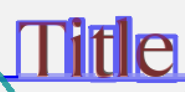
Okay... Well I am missing one bit, while the text DOES start at roughly our boundStart that we determined from the text width previously, we are forgetting that text actually has some margin horizontally... And again we can estimate it from the PDF, I'll skip the math, for Title it's around 4.17px inwards (it's a little more actually but) the formula is (1404/2-936/2)-238.17 where the last value is the text X position on the pdf in pixels, the rest might already be familiar to you from this blog.
So now we can calculate and determine every detail about text. There are some things that I actually haven't yet fully analyzed and so I can't share, such as what happens when text overflows even on a single paragraph? It's obvious that anchors would handle this, and that we could determine line spacing heights for the different styles using PDF, but maybe that's an investigation for another time.
Conclusion
In reality, I wouldn't call this a good text system, a lot of the data is determined by the device such as the positions and so forth, the fonts are also stored on the device. But any subtle changes that may be made to anything would effect your document.
Considering the compatibility standpoint that reMarkable has been taking with their increased device list, I would have thought that they would start putting some of the values on the document, and they did put the column width I guess, but then they bound it to the rm2 screen size, instead of making it a percent or bounding it to the paper size on the format. It really baffles me that they try to store extra data and still fail to make good use of it...
Either way the lack of internal information only makes things harder for us, I'm sure reMarkable will find a workaround if they ever stumble into an issue caused by their own decisions, or who knows, you might update your tablet one day to find your kitty overlapped by text despite their best efforts to avoid that exact issue.
That's all from me, for now.
- Red

